/PROFESSIONAL DESIGN WORK
Together Festival Installation (2013)
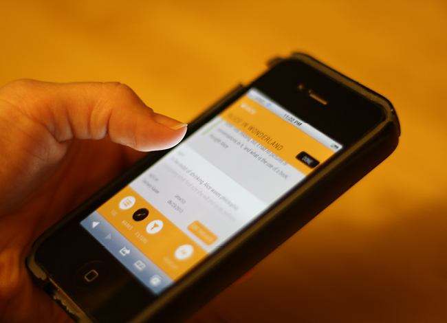
This installation was designed and developed with my partners at Skeptic. My role: concepting, sourcing hardware, initial Arduino code development.
This installation was designed and developed with my partners at Skeptic. My role: concepting, sourcing hardware, initial Arduino code development.
The
goal of the piece was to move the focus of the experience towards the
audience, reminding them that they are integral to the performance.
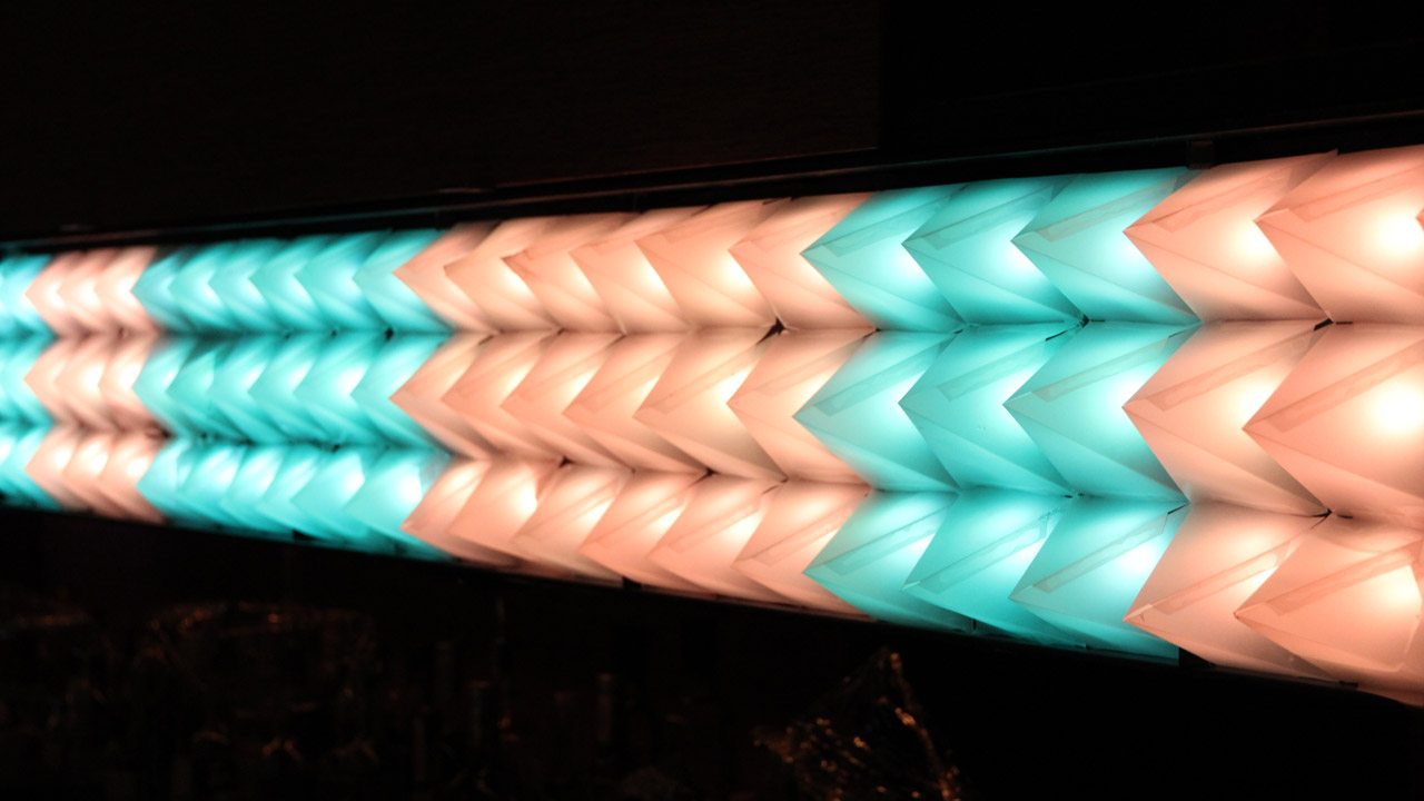
When we visited the space, we were inspired by the regularly-spaced steel bars that traversed the entire ceiling. We immediately began to see a grid of some sort, floating above the crowd, and lighting up in time with the music. So that's what we built.
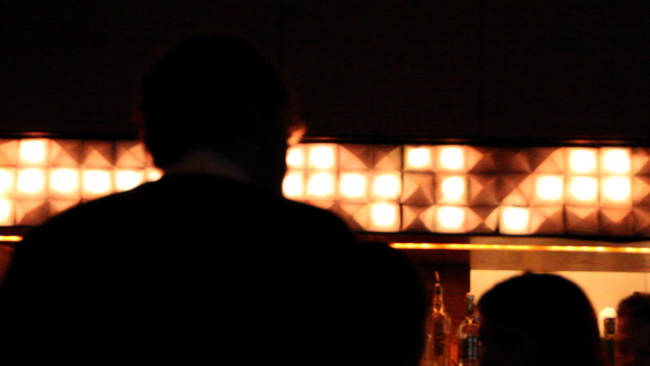
Using industrial lighting diffusers commonly found in office drop-ceilings, 300 LEDs, and an Arduino micro-controller, we created an 8’ x 12’ audio-reactive display that was mounted on the ceiling over the dance floor. And Four Tet, notorious for only using house lights during his performances, even told the crew to leave it on.
When we visited the space, we were inspired by the regularly-spaced steel bars that traversed the entire ceiling. We immediately began to see a grid of some sort, floating above the crowd, and lighting up in time with the music. So that's what we built.
Using industrial lighting diffusers commonly found in office drop-ceilings, 300 LEDs, and an Arduino micro-controller, we created an 8’ x 12’ audio-reactive display that was mounted on the ceiling over the dance floor. And Four Tet, notorious for only using house lights during his performances, even told the crew to leave it on.
/PROFESSIONAL DESIGN WORK
Middlesex Lounge Installation, 2013
Designed and built with Skeptic (Daniel Buckley, John Howrey, Jeff Bartell, and Gabi Schaffzin)
Designed and built with Skeptic (Daniel Buckley, John Howrey, Jeff Bartell, and Gabi Schaffzin)
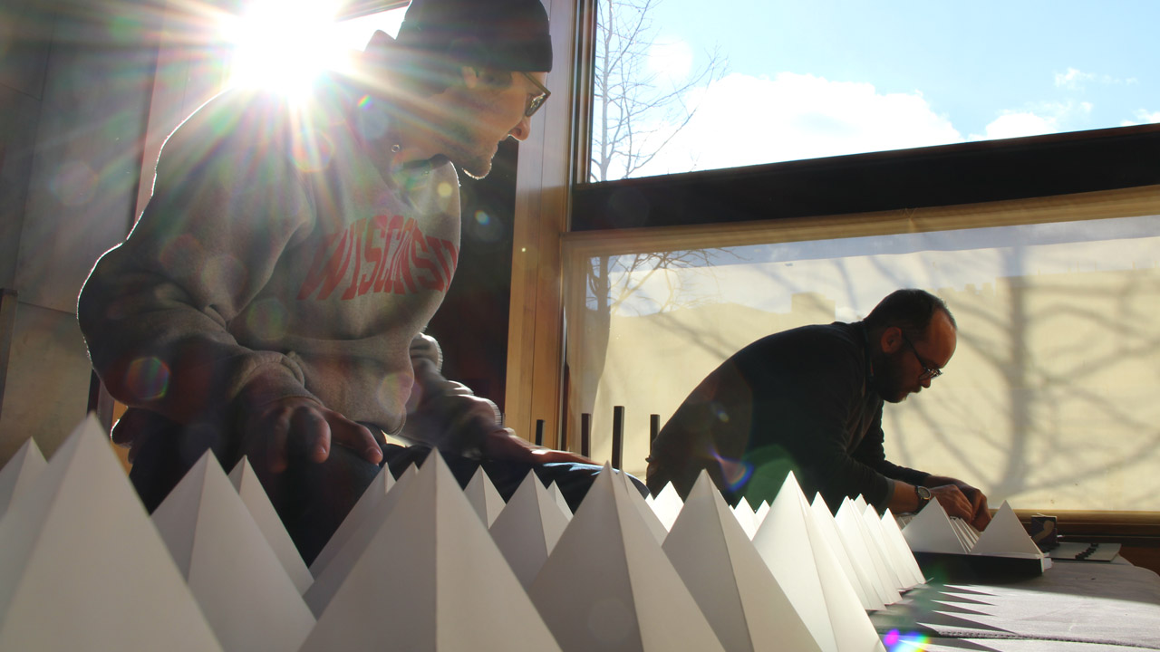
Top notch DJ’s, superb cocktails, and a line out the door every week-end—all that was missing was something to help the minimalist decor pop. So when we were invited to install a piece of our choosing at Middlesex Lounge in Cambridge, MA for the parent company’s holiday party, we jumped at the opportunity. We were so enthusiastic about it, in fact, that we soon found ourselves in a mini-assembly line, scoring, folding, and gluing 180 vellum pyramids.
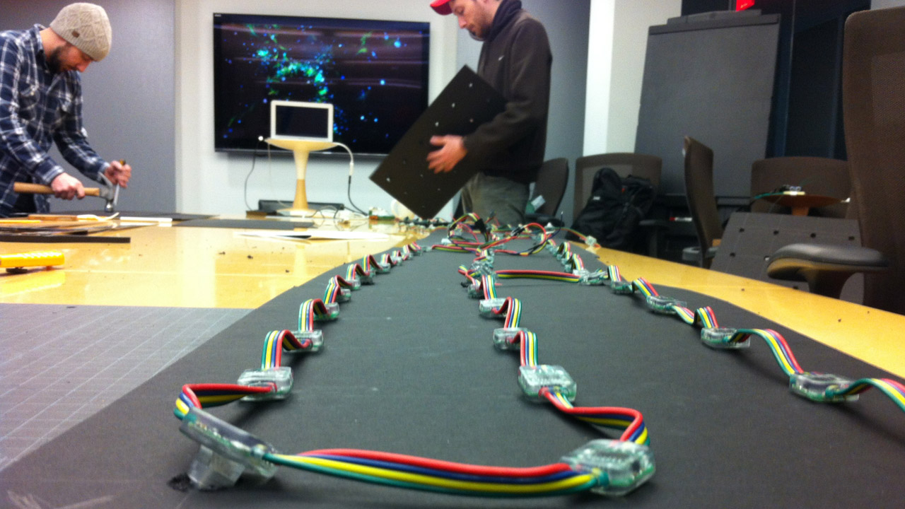
Controlled by an Arduino board, the 180 addressable LED’s feature pre-programmed animations that change slightly based on the reading from the piezo-electric sensor we attached to the house subwoofers.
Controlled by an Arduino board, the 180 addressable LED’s feature pre-programmed animations that change slightly based on the reading from the piezo-electric sensor we attached to the house subwoofers.


/PROFESSIONAL DESIGN WORK
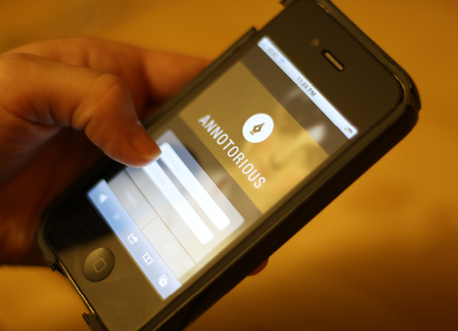
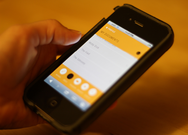
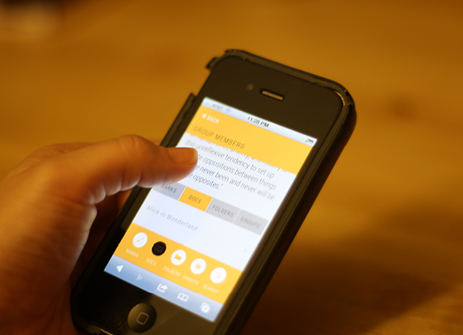
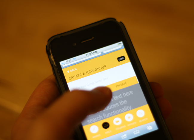
Annotorious (2013)
Designed with my partners at Skeptic. My role: research, information architecture, and HTML/CSS development for mobile.
As we increasingly engage in reading and note-taking experiences on our mobile devices, how do we annotate digital texts, and discuss and share these annotations?
The open-source development team at Annotator, working with the Hypermedia Studio at MIT, has been building the code-base to turn any digital text into a site of collaborative learning. As this project continues to unfold, Skeptic was commissioned to research, design, and build the tool's mobile experience, entitled, "Annotorious."
At Skeptic, our process always begins with research, and this project was no different. We read studies on the ways in which people engage with long-form reading experiences on mobile devices. We pored over data from studies about the use of web-based annotation tools in the classroom.
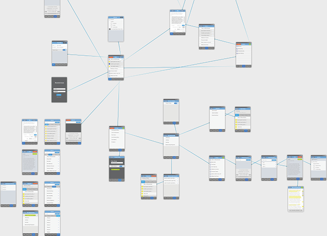
From our initial research, we moved into information architecture sketches, which included a working session with the team from Hyperstudio.
Designed with my partners at Skeptic. My role: research, information architecture, and HTML/CSS development for mobile.
As we increasingly engage in reading and note-taking experiences on our mobile devices, how do we annotate digital texts, and discuss and share these annotations?
The open-source development team at Annotator, working with the Hypermedia Studio at MIT, has been building the code-base to turn any digital text into a site of collaborative learning. As this project continues to unfold, Skeptic was commissioned to research, design, and build the tool's mobile experience, entitled, "Annotorious."
At Skeptic, our process always begins with research, and this project was no different. We read studies on the ways in which people engage with long-form reading experiences on mobile devices. We pored over data from studies about the use of web-based annotation tools in the classroom.
From our initial research, we moved into information architecture sketches, which included a working session with the team from Hyperstudio.
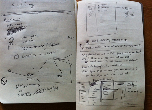
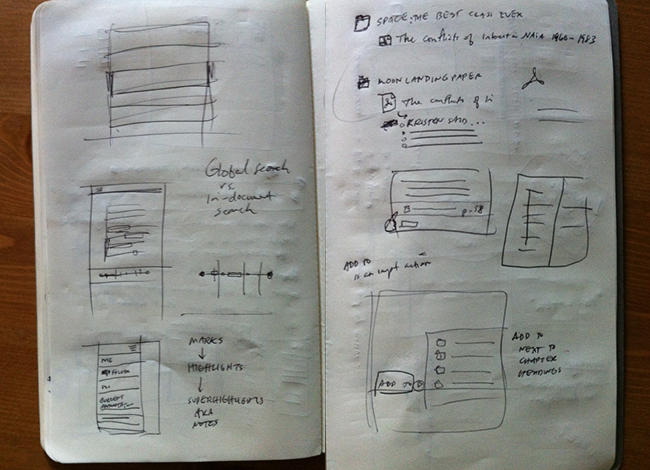
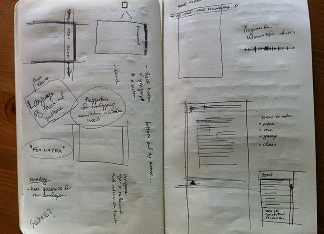
From this initial sketching stage, we moved on to developing more robust IA concepts and user flows for the ways in which we imagined the mobile annotation experience might be used. During this process, we developed user scenarios that would later become testing scenarios and scripts for the Annotorious team to use in evaluating their functional prototypes.
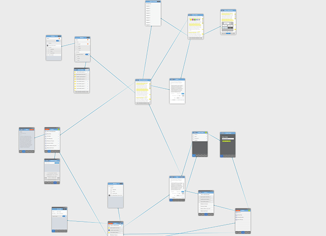
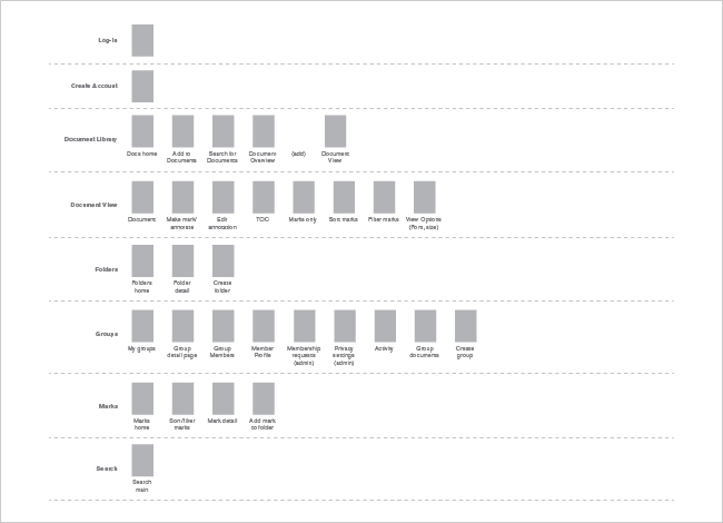
After the IA phase was complete and the page types, scenarios, and flows were approved, we began work on design and front-end development. Our work entailed creating a visually elegant user experience and developing the page types as static, front-end HTML and CSS. Our work on the information architecture of the mobile experience as well as the interface design and development allowed the development team at Annotorious to focus on implementing the Annotator back-end.
/PROFESSIONAL DESIGN WORK
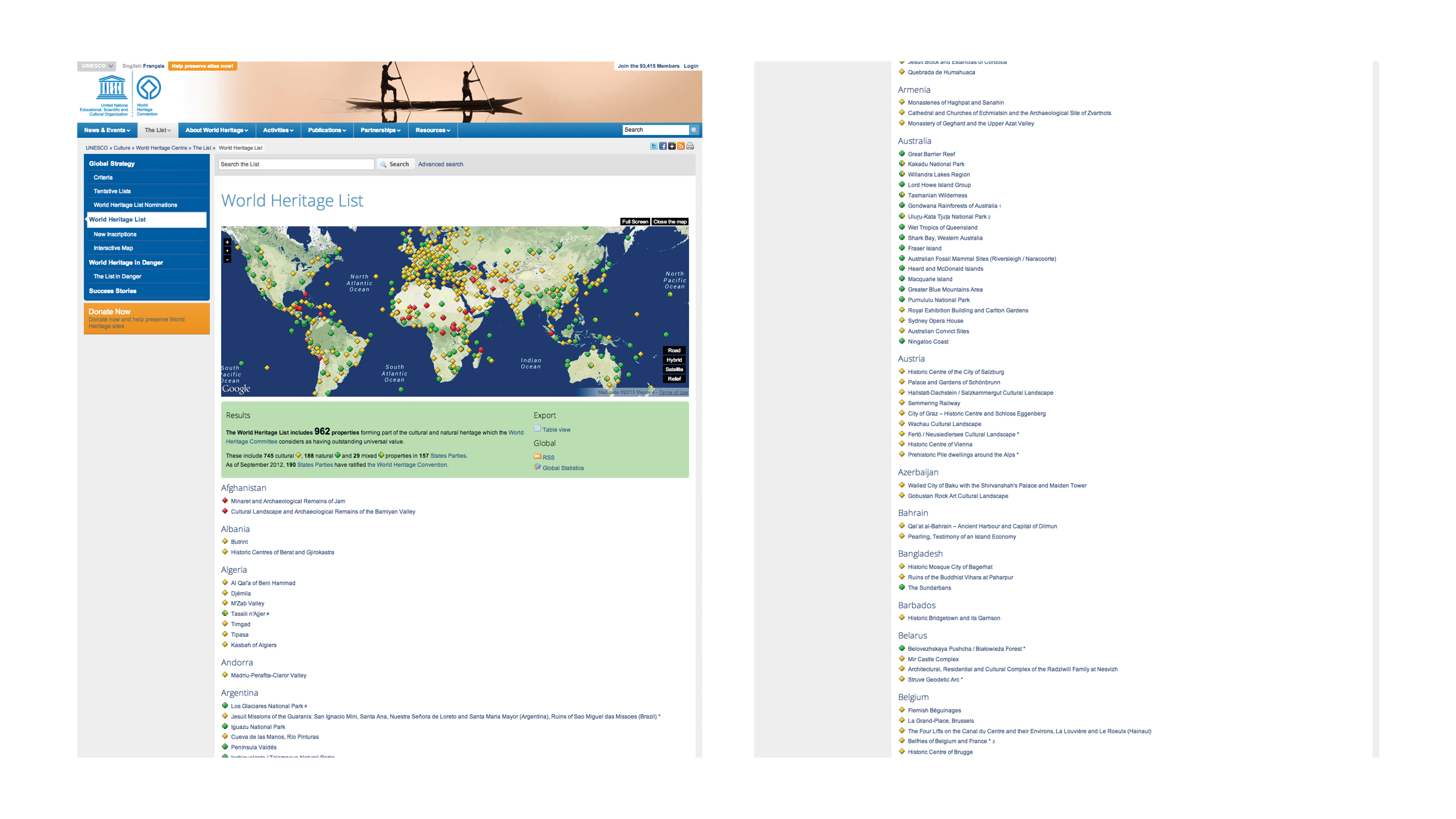
People Protecting Places (2013)
Completed with my company, Skeptic. My role: research, information architecture, visual design concepts, project management.
UNESCO's World Heritage Convention and its employees and volunteers protect 962 of our world's most important places. These places are of historic or ecological significance to humanity. My partners and I at Skeptic were brought in by ISM to help the WHC showcase the incredible work it does.
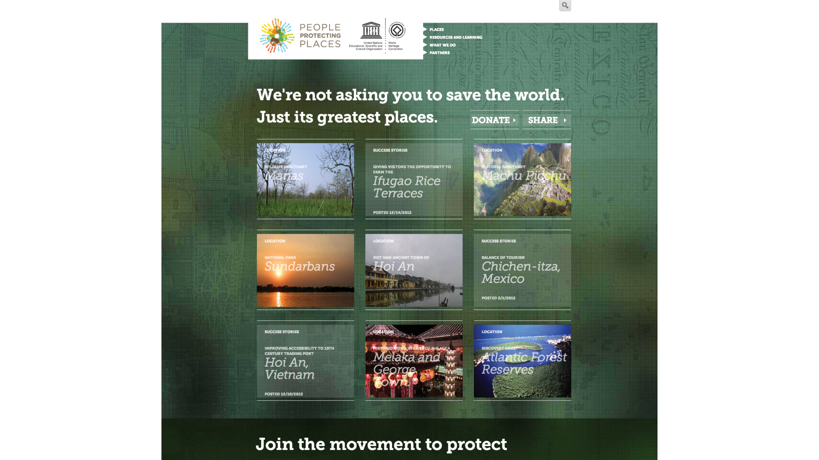
Our goal was to design and develop a new, public-facing website for the WHC, called People Protecting Places. The focus of the site would be to showcase these incredible places throughout the world, to increase tourism to these places, and to increase donations to the programs that help preserve them.
At Skeptic, we use a three-part methodology for every project: research, design, build. In the research phase of this project, we began by poring over the data on the WHC's current website.
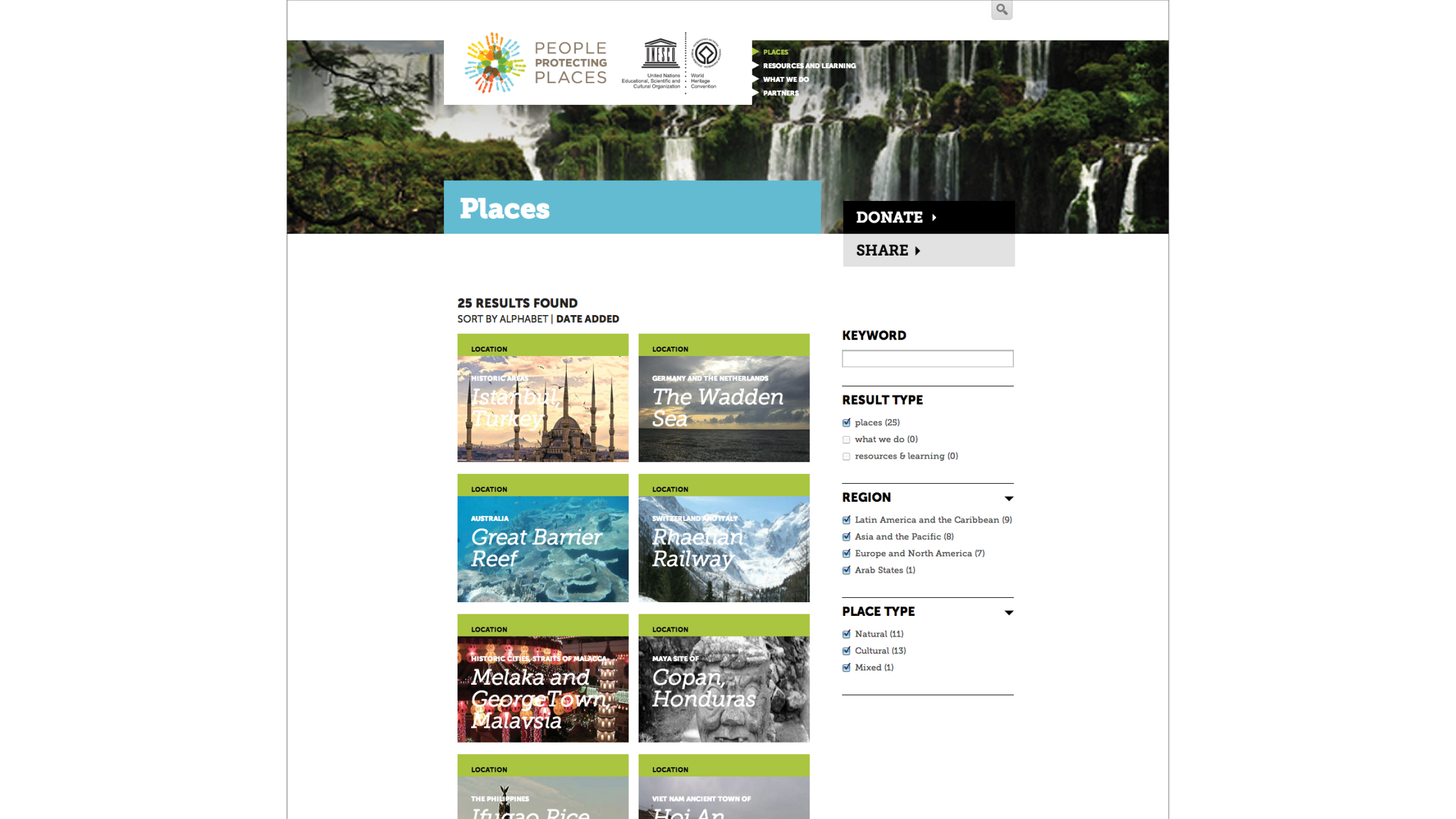
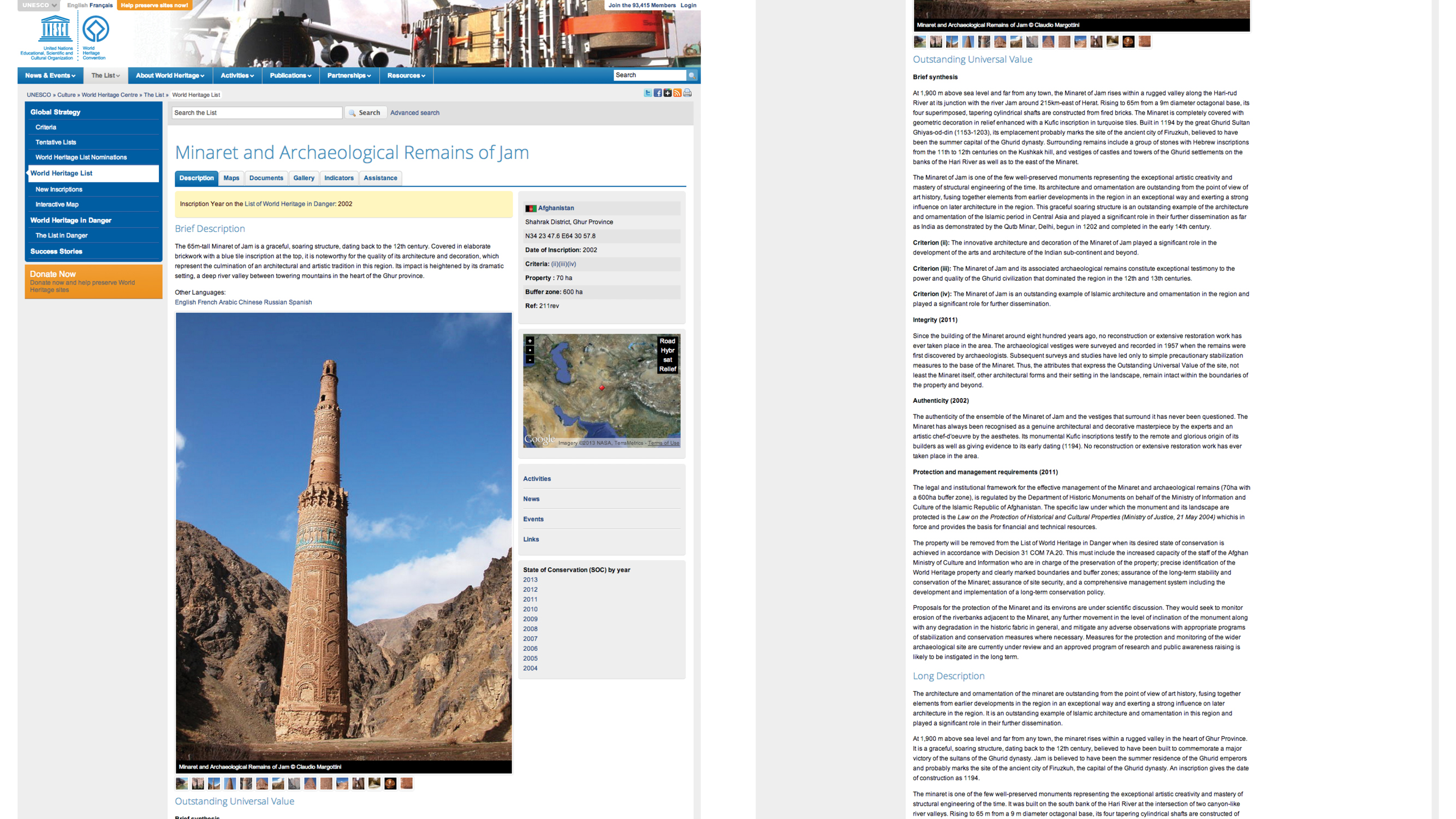
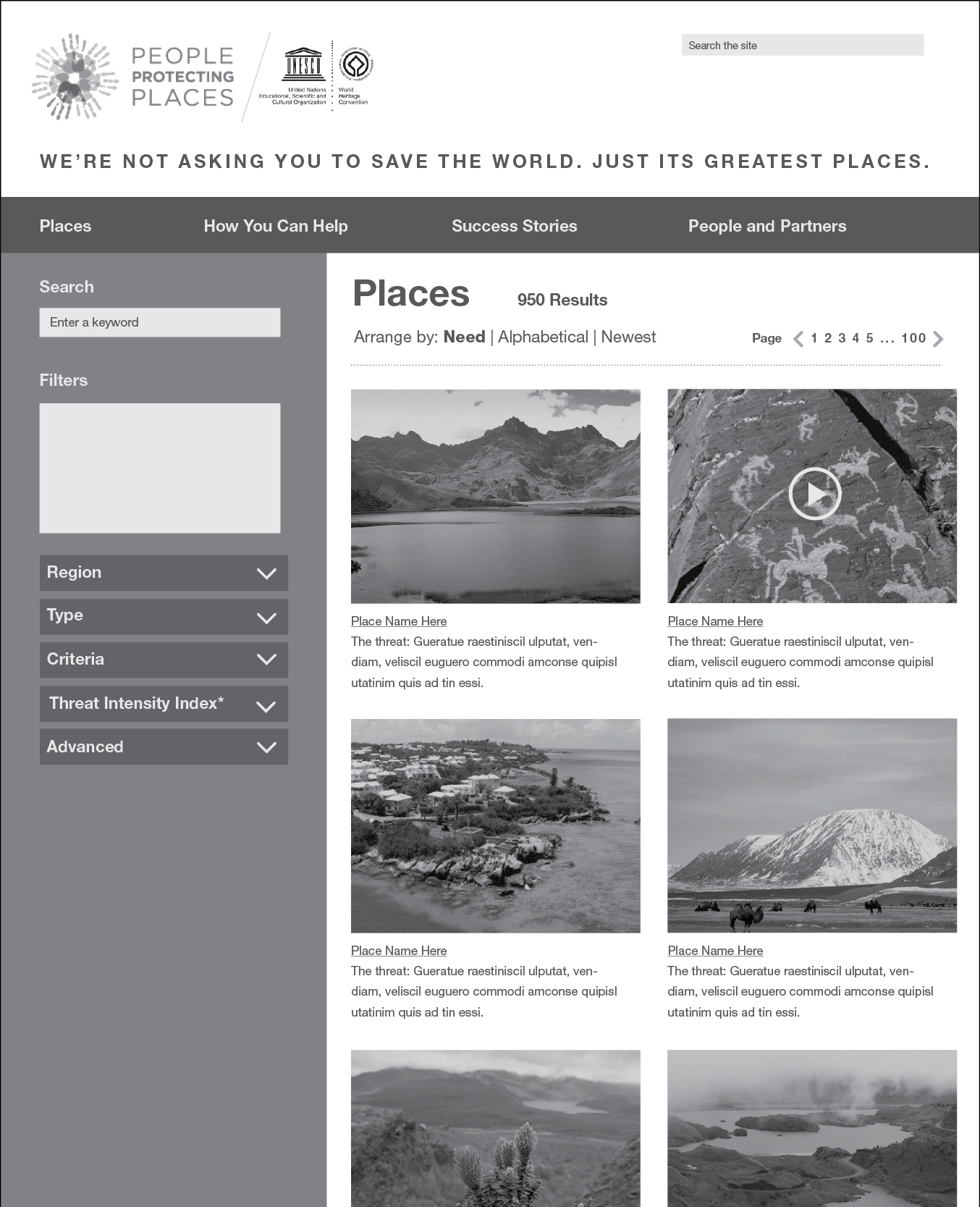
There is a map and a list indicating the name and location of each of the 962 places on the World Heritage List.
Completed with my company, Skeptic. My role: research, information architecture, visual design concepts, project management.
UNESCO's World Heritage Convention and its employees and volunteers protect 962 of our world's most important places. These places are of historic or ecological significance to humanity. My partners and I at Skeptic were brought in by ISM to help the WHC showcase the incredible work it does.
Our goal was to design and develop a new, public-facing website for the WHC, called People Protecting Places. The focus of the site would be to showcase these incredible places throughout the world, to increase tourism to these places, and to increase donations to the programs that help preserve them.
At Skeptic, we use a three-part methodology for every project: research, design, build. In the research phase of this project, we began by poring over the data on the WHC's current website.
There is a map and a list indicating the name and location of each of the 962 places on the World Heritage List.
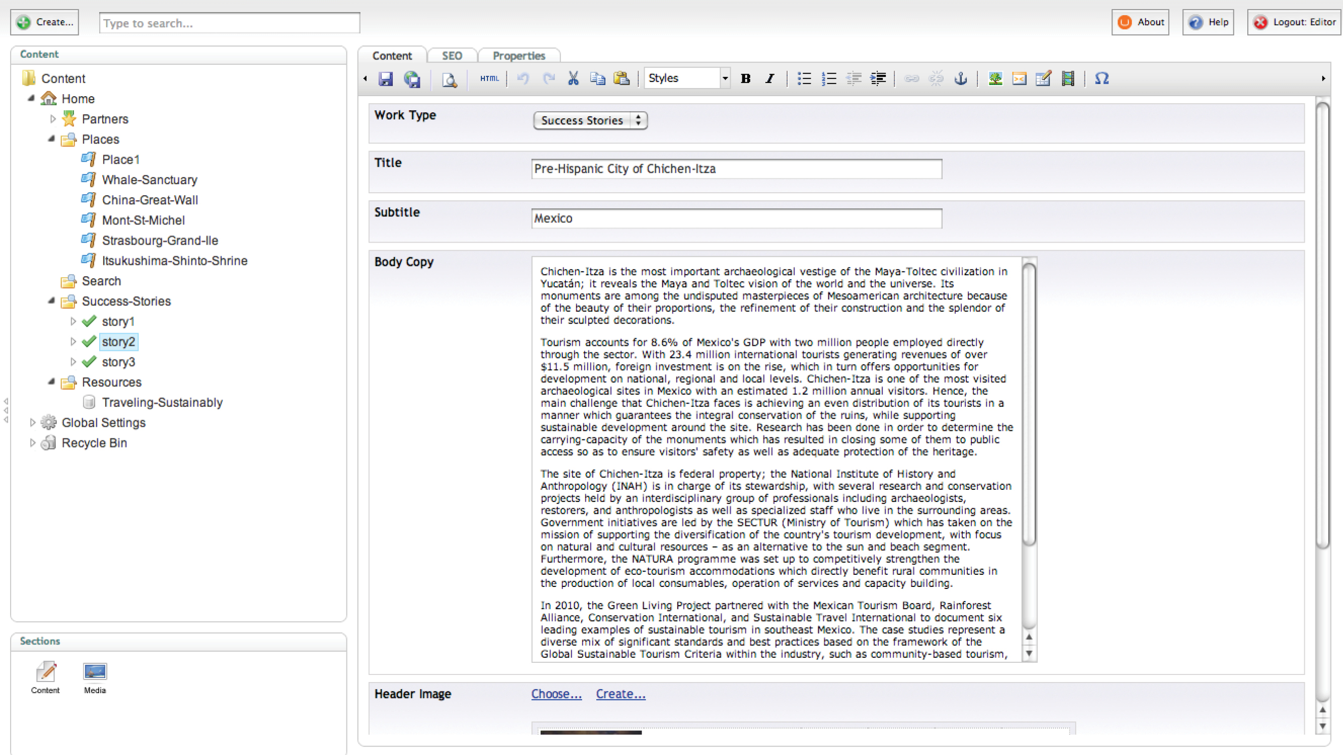
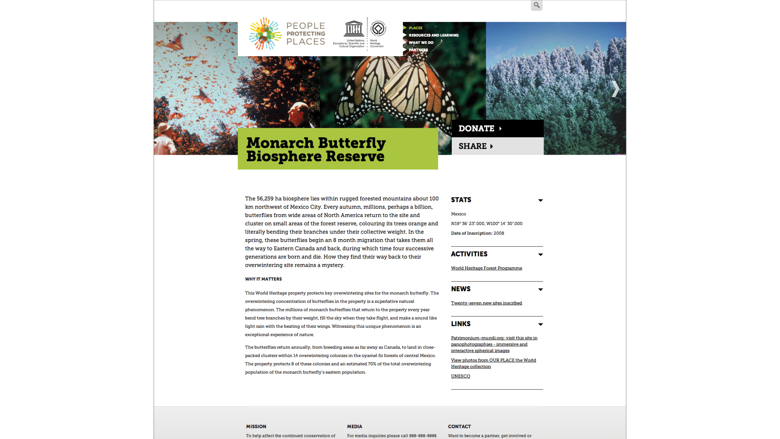
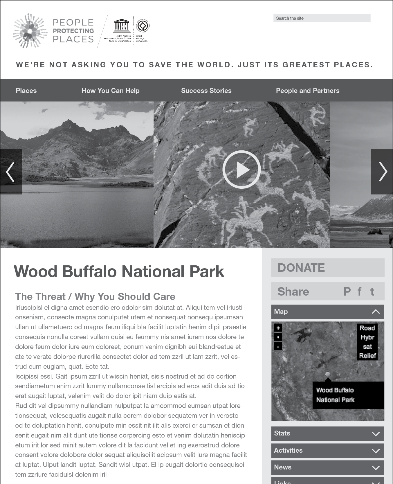
Clicking into each item on the list reveals an amazing amount of information about each of these places.
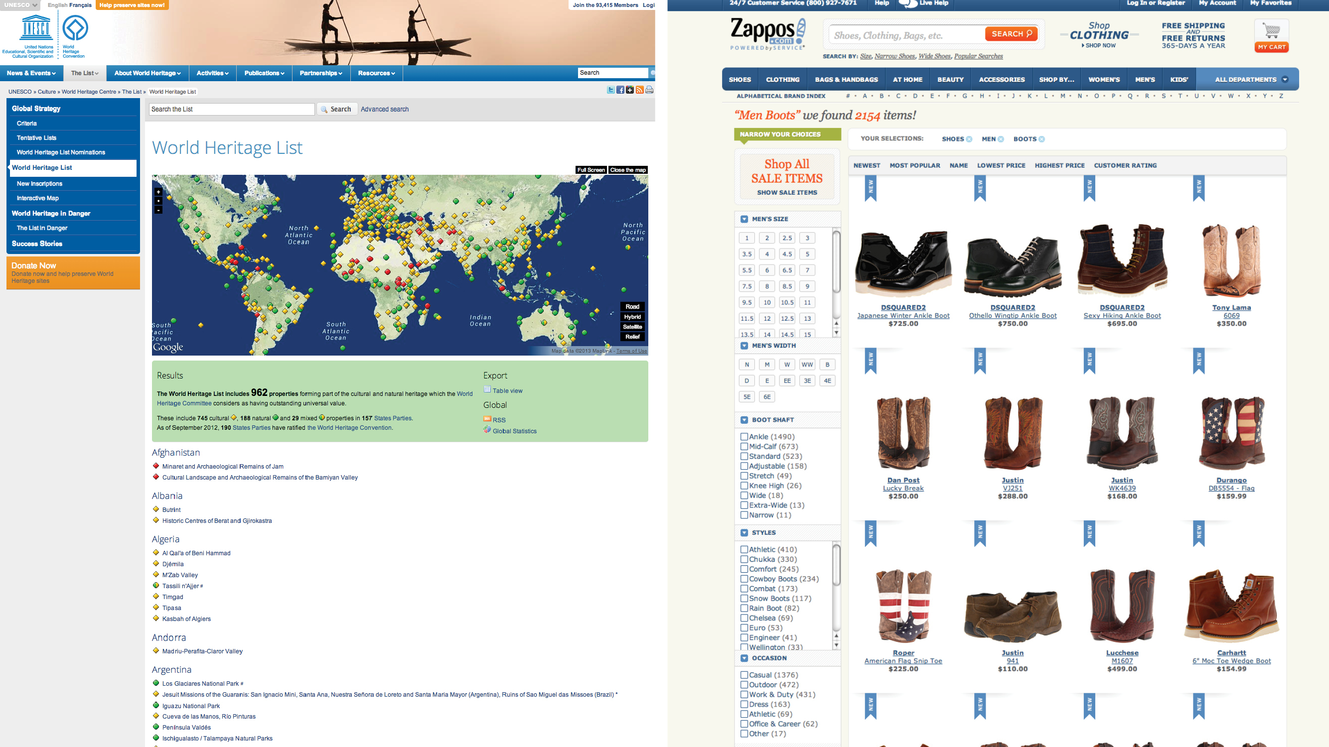
We used the analogy to create the notion of "place detail pages" based on product detail pages in e-commerce.

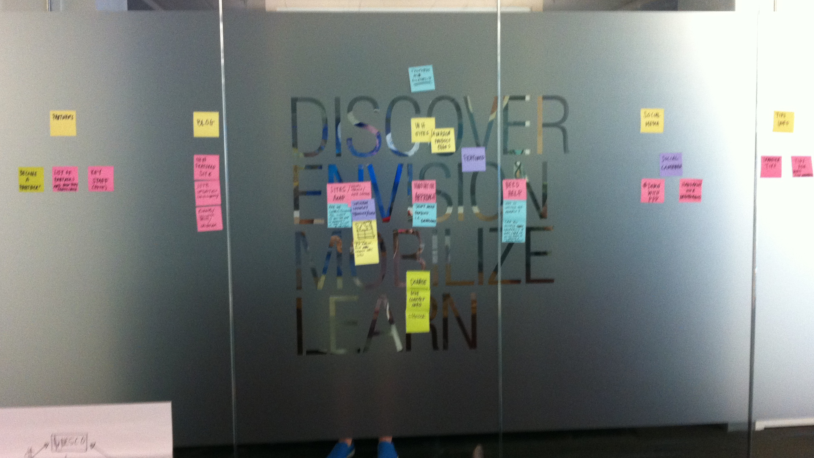
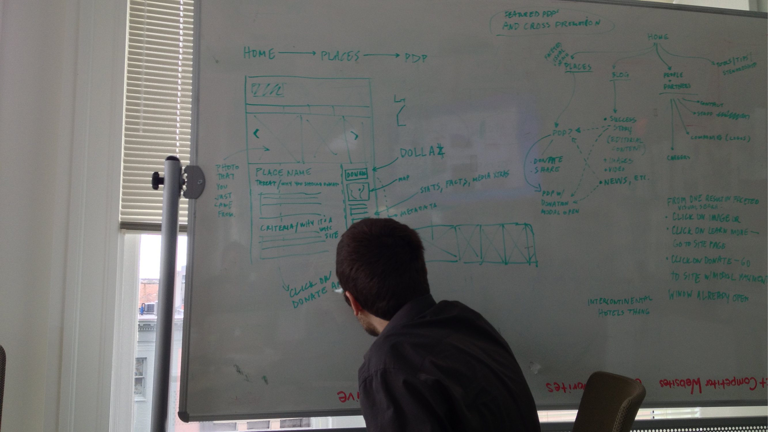
After developing a loose structure for categories and hierarchies of information within the site as a whole, we moved to more detailed sketching and considerations of site-mapping as well as page-level IA.
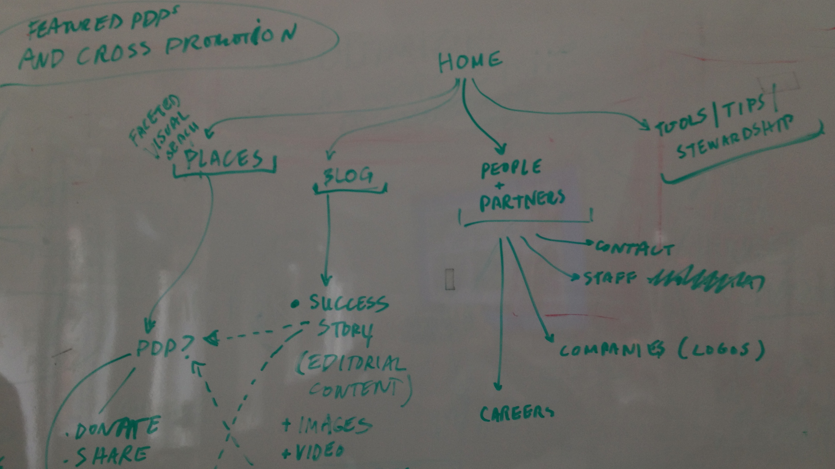
It was very important to us that the site be a highly visual experience. To be "consumer-facing," we needed to develop an experience that felt familiar to users. Our ideas referenced the visual browsing experience of e-commerce sites, as well as other highly-visual, popular experiences such as Tumblr, Pinterest, and Flipboard.
Based on our research and discussions with the client, one set of deliverables for the IA phase of the project was a set of high-fidelity wireframes. We refer to these as "high-fidelity" because they teeter on the edge of designs. We were willing to risk this potential process pitfall because we knew that such a visual experience needed to be communicated to the client at a higher level of detail than the level of detail at which we might typically deliver wireframes in other contexts.
Based on our research and discussions with the client, one set of deliverables for the IA phase of the project was a set of high-fidelity wireframes. We refer to these as "high-fidelity" because they teeter on the edge of designs. We were willing to risk this potential process pitfall because we knew that such a visual experience needed to be communicated to the client at a higher level of detail than the level of detail at which we might typically deliver wireframes in other contexts.
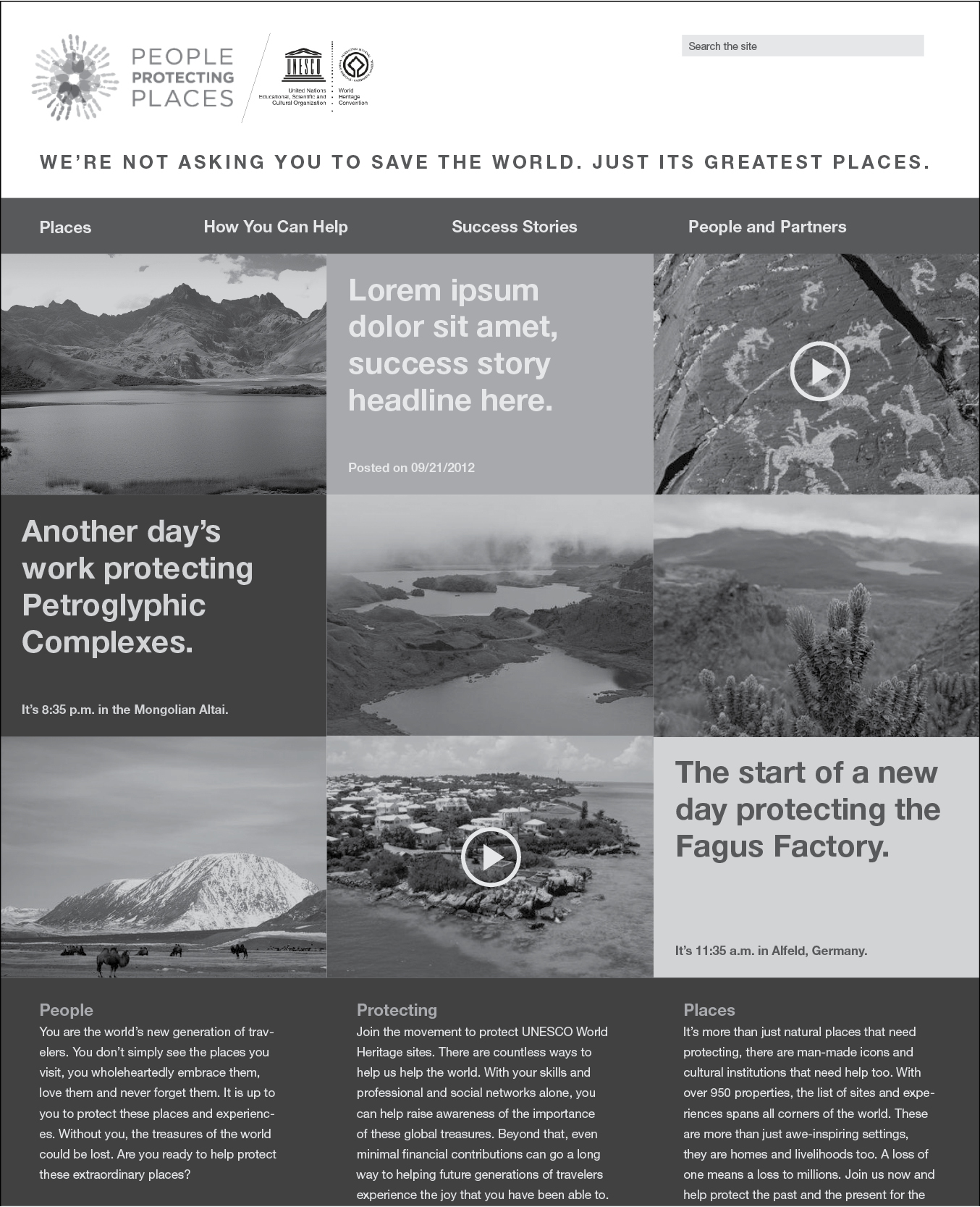
Because this site is intended for use by folks who might not know a whole lot about any of these places, and because there are so many places being protected, we needed to make the site more than just a visual experience. The places needed to be searchable, sortable, and filterable. We therefore implemented a faceted search while retaining large thumbnail imagery so that the experience remained primarily visual.
As we moved into the design phase of the project, it was important for us to demonstrate that the detailed wireframes could become designs in a myriad of different ways. We therefore presented three wildly different design directions from which the client selected one for continued refinement.
After settling on a design direction and getting approval on the designs for all the major page types (home, search results, place detail page, etc.), we began work on the build phase—development.
While priding ourselves on our diverse skill sets and abilities, including web development, we at Skeptic know our limits, and we knew something this large and highly database-driven would be better suited for someone else. Thankfully, we have an awesome network of talented colleagues and friends who can lend us a hand.
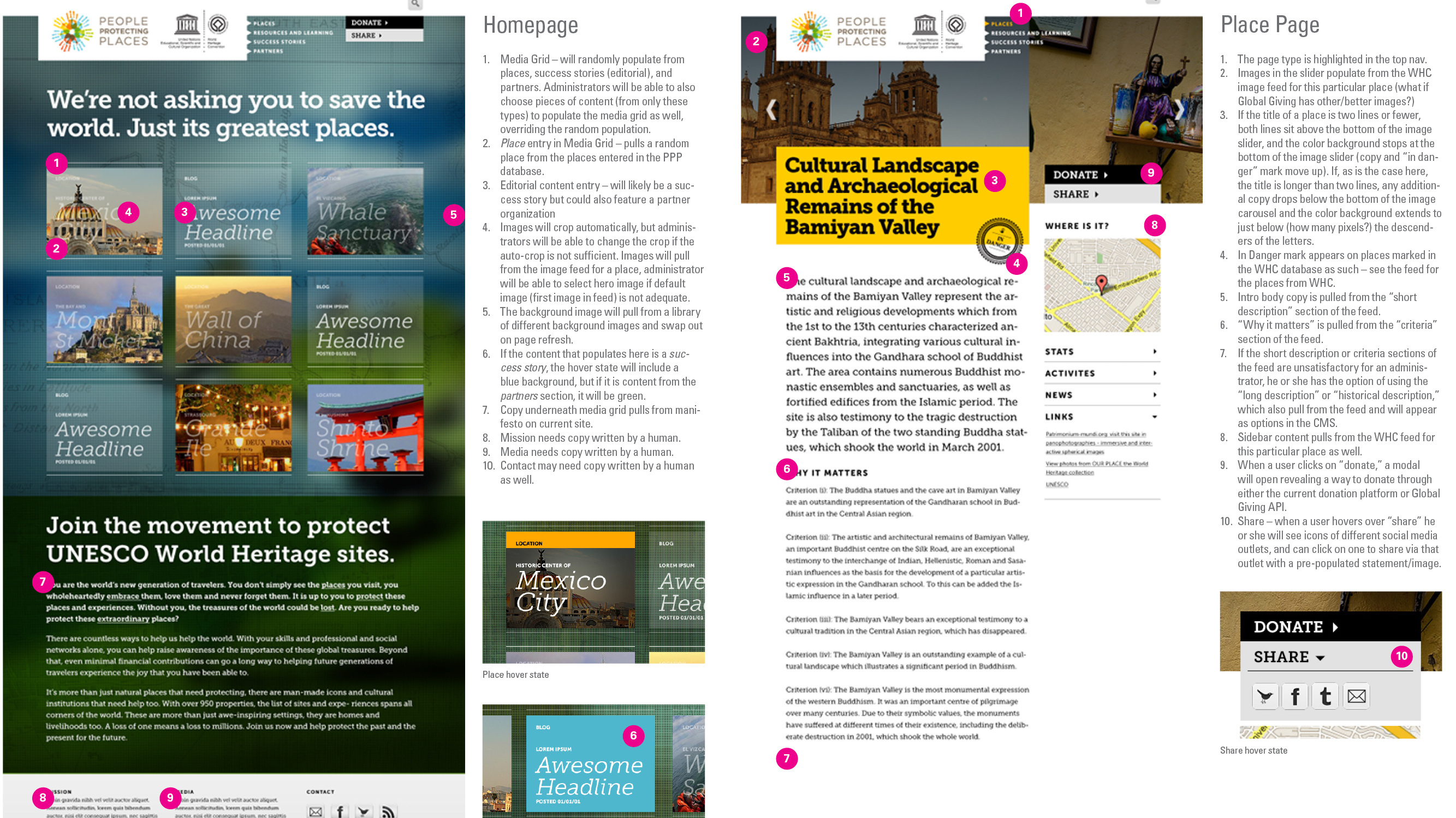
Our developer for this project, for example, is a friend of ours who lives in New York. Because he couldn't be with us in person for every meeting and whiteboard session, we needed to make him aware of every little decision we made regarding the site, particularly as we wrapped up the design phase. We therefore created a detailed set of annotated designs, which specified not only the visual design of the site, but also specified the behaviors and places from which data would be pulled from different databases at the WHC. These annotated specs even included the language that would auto-populate text fields when users shared a place or photo on different social networks.
In addition to there being a group of users for whom we were designing the front end of the website, there was an entirely different group of users that would need to be able to add, edit, and remove content from the website on the back end. We therefore worked closely with our developer to create a back-end user experience that made sense for the individuals who would be working with the site day-to-day.